Posts

Height Requests

Image
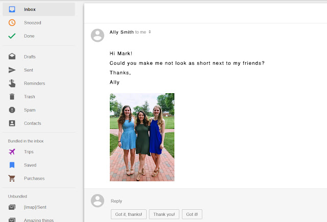
The Email So I received this email the other day: Yes Ally, I absolutely can. The Transformation First, we will need to start with the Quick Select tool. We will only need to select her dress and above. From here, just Ctrl-C the selection, make a new layer, and paste the selection into the new layer. Resize to make slightly larger. Because the resized dress did not immediately blend with the lower layer, I needed to use the Smudge Tool to blend the two dress layers. I also needed to mask her arms and replace them with differently positioned arms that made her new height seem a bit more "natural." I covered them with arms from a stock photo. The Final Result While this is obviously not a serious edit, it actually didn't turn out too terribly. Of course, there can still be much more improvement that can be done with more time and experience. Such elements for improvement include more consistent skin tones, more proportional arms and legs, et

The Colors of Nature Valley

Image
The Setup For this assignment, we needed to take a picture of an object or scene with inspiring colors and use InDesign to create color swatches. We then use these color swatches to format personal name tags. I chose to take a simple picture of a Nature Valley Granola Bar that is always passed out at the morning kiosks. I opened it up in InDesign and I think it generated some interesting color choices. Out of all the colors it gave me, I chose three: grape, forest, and lemon. For the tints, I used the following values: 100%, 75%, and 35%. The Result The colors generated were definitely cool choices. I specifically chose the bright color pallet as that seemed the most visually appealing of all the variations. The name tag variations all look pretty visually pleasing as well. My favorite I think would have to be the last one. However, reviewing my work, I feel like the deep green is a bit too green. I don't think it's off-putting nor completely dissonant from the ot

Brochure Inspiration

Image
I didn’t find a three-panel brochure in person. So, instead, I found a simple one I liked online. This is just a general brochure, nothing special, but I believe it follows the guidelines quite well. Limiting Color & Contrast There are only three main colors that make up the brochure. The designer chose tan, white, and a deep ocean blue. The majority of the brochure is made up of the cool blue hue along with some deviants of it. To create the eye-catching contrast, islands are shown in a lighter tan. Important brochure information is in white or has a white backdrop to cleanly segregate it from its surroundings. As discussed in the GoMedia article on contrast, effective contrast can be displayed using the “grey-scale test.” As you can see from the converted image below, the brochure maintains it’s contrast and attention-grabbing effectiveness. Limiting Fonts This brochure did a great job of limiting its fonts. The brochure used a clean and m

Jet Skis vs Bikes

Image
The Photostory , a quick guide describing the best way to format and design a photostory, outlines a few key points to keep in mind when editing your photostory: 1.      Choose five to six photos — you do not want too many photos. 2.      You need one large, dominant lead photo — this photo is supposed to grab the reader’s attention and visually “summarize” or “introduce” the topic. 3.      Remove obvious clichés — you’re supposed to be telling a story that most people haven’t heard or at least not in the way you’re presenting it. 4.      Pictures in completely chronological order may not be the best — you might consider laying out your photos by theme or idea instead. 5.      Keep white spaces on the outside of the layout and smaller spaces between photos are consistently the same size. To better illustrate these key points, let’s examine the best case that follows the key points contrasted with the worst case. BEST WORST versus Immediately

Cropping Singapore

Image
Since we could choose any photo we took with distracting elements, I decided to use one of the pictures that I took in Singapore that had some distracting elements. This shot is of the tops of the old colonial-style government buildings featuring the Arts House in the foreground and the main dome of The National Gallery of Singapore the next layer behind. Originally, the shot was supposed to utilize the framing aesthetic. However, the framing elements (trees) just didn’t add to the shot — they distracted from the subject (the dome). So instead of having the dome framed by the trees, we are going to crop them out. First, we need to select the crop tool and select the 1x1 Square Crop ratio to ensure a proportional crop. This crop focuses the viewer’s focus on the dome and the interesting architecture surrounding it. The next step is to add a Levels mask to the sky only. Adjusting the levels makes the sky more dynamic as clouds are more defined and blues are le

Working Smith Library

Image
It’s interesting how daily things can be seen differently if you just take the time to observe or “work the shot.” All my shots for this assignment were of the front of the Smith Library. While definitely not the most amazing pictures, I was surprised how much there was actually to work with that is missed at just first glance. I am sure that this is true for most subjects. Symmetry This is a pretty basic shot. It shows that, while the building is very “busy” in design and in the foreground, it still maintains a great deal of symmetry. The windows behind each of the columns, the two lampposts, the giant eagle sitting right the middle, etc. Angle This was taken while looking up at the top of the columns in front of the main doorway. I’ve actually never noticed the shadows that are created at night by the illuminated columns. An interesting shadow hatch-work is created. Lines For the lines shot, I used the lines in the brickwork. This is defi

About Me

Image
Hi there! My name is Mark McKinney and I am currently a Sophomore at High Point University. I am originally from Pasadena, California which is the same place that the Rose Parade and Rose Bowl are held. At High Point, I am majoring in Entrepreneurship and minoring in Strategic Communication. With that education, I hope to start my own tech startup as starting my own business has always been a dream of mine! Interests I have a ton of interests which can sometimes make it difficult to focus on just a couple things! But, three of my most favorite would include rowing crew, photography, and building startups. Rowing had always been a sport that I dreamed of being able to do, but my High School just didn’t have a crew team. So, instead, I ran track as a sprinter (which I also enjoyed). Luckily, HPU had a rowing team and it’s been a blast! I got my first real camera when I was about seven-years-old and I have been taking tons of pictures since! I have just recently gotte