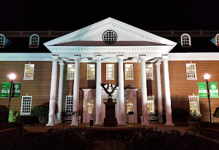
Working Smith Library
It’s interesting how daily things can be seen differently if you just take the time to observe or “work the shot.” All my shots for this assignment were of the front of the Smith Library. While definitely not the most amazing pictures, I was surprised how much there was actually to work with that is missed at just first glance. I am sure that this is true for most subjects.
Symmetry
This is a pretty basic shot. It shows that, while the building is very “busy” in design and in the foreground, it still maintains a great deal of symmetry. The windows behind each of the columns, the two lampposts, the giant eagle sitting right the middle, etc.
Angle
This was taken while looking up at the top of the columns in front of the main doorway. I’ve actually never noticed the shadows that are created at night by the illuminated columns. An interesting shadow hatch-work is created.
Lines
For the lines shot, I used the lines in the brickwork. This is definitely a position I would have never considered. While different and a bit more interesting, I think this shot works better if the lines directly lead to the middle of the subject rather than the offset position shown here.
Depth
By adding the fountain as another layer, the Smith Library entrance seems much grander. However, now looking back at it, it would have been better to probably add another smaller layer to take out the prominence of the fountain as it overshadows the main building which is the subject.
Frame
The final shot using the two of the six front columns as a frame for the doorway.
* * *


Comments
Post a Comment